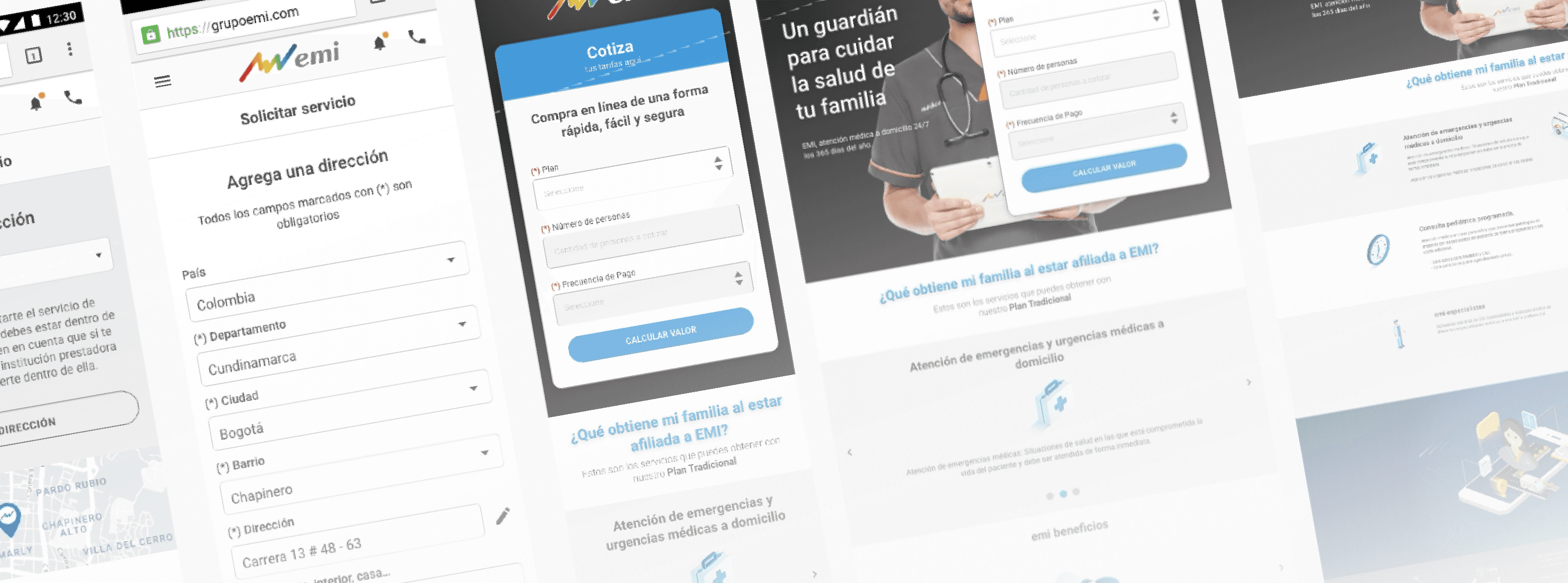
EMI


I led the research that unlocked EMI's digital transformation: 15 users showed that 82% rejected the app not out of resistance to change, but because of misaligned design. That finding convinced the client to abandon their assumptions and redesign from scratch — and a feature not in the original brief, real-time medical video calling, became the platform's central differentiator.
Patients in crisis, doctors en route and ambulance dispatchers operating on completely disconnected channels.
Design an ecosystem that coordinates home care and telemedicine in critical time, without disrupting existing emergency flows.
End-to-end service blueprint: from patient to dispatcher to doctor en route, with every handoff designed, validated and documented.
A continuous-care experience that cuts friction between actors at the most critical moments of the health journey.
EMI's care model was 100% in-person and phone-based. When the business sought digital transformation, internally proposed solutions generated massive user rejection — without anyone understanding exactly why. The company needed a functioning digital channel to reduce dependence on human operators and improve response times in real emergency situations.
Users rejected digital solutions not out of resistance to change, but because they didn't address their real needs. Flows weren't designed for high-stress moments. The information architecture didn't reflect the mental sequence of someone mid-medical-emergency. And the lack of real-time feedback forced them to call by phone to confirm whether a request had been received.
Without a digital channel users would genuinely adopt, EMI remained dependent on its human operators' capacity to scale. Digital transformation couldn't advance on a design foundation the user themselves rejected.
- Users access the app during real emergencies — high stress, high stakes
- Users span a wide range of ages and digital literacy levels
- Variable connectivity in home-care coverage areas
- Critical time to market: commercial agreements with the client were at risk before I joined
EMI members need to request emergency medical care and track it in real time from their smartphone, without calling an operator.
The system made it hard. Confusing interface, unclear information architecture, flows misaligned with real user needs — and designed without accounting for the emotional context of a medical emergency.
JTBD methodology combined with in-depth interviews and operational shadowing with 15 users. Findings revealed the client assumed rejection was cultural; research proved it was a design problem. The 82% rejection rate and 8% service findability satisfaction unlocked the decision to redesign from scratch.
Built from real behaviour patterns — not stakeholder assumptions.
Gloria Cuadros Rueda
53Needs care without waiting on hold; uses the digital channel during family medical emergencies.
A tool that reduces anxiety, with clear portfolio info and immediate service access.
Johanna Arévalo
35No landline; manages everything from her phone. Wants frictionless care for herself and her daughter.
A fast, efficient, innovative app with the full portfolio accessible from mobile.
Johanna Arévalo
25Uses the app to show the portfolio to clients. Limited data plan makes her anxious about data usage.
App as a work tool: clean design, clear navigation, available offline or low-data.
María Méndez
50+Basic app knowledge. Fear of unfamiliar interfaces creates friction before she even opens the app.
A friendly, intuitive app with clear text, designed for her age, that conveys trust and security.
Discovery — JTBD + interviews + shadowing
In-depth interviews with 15 users (members and field doctors) + operational shadowing + short stakeholder interviews. Key decision: use JTBD instead of traditional surveys to understand real motivation, not just stated preference. Output: real friction map and proto-personas.
Research and synthesis — the data that unblocked the client
Empathy maps, satisfaction analysis, health app benchmarking. Key finding: 82% rejection + 8% service findability satisfaction. These data directly contradicted the client's assumptions and were the argument that unlocked the decision to redesign from scratch.
Design and validation — wireframes, A/B testing and the video call
Navigation architecture redesign. Wireframes and prototype in Adobe XD. A/B testing to validate decisions between variants. Key decision: video calling as the main channel emerged from the JTBD "I want to know someone is attending to me in real time" — it wasn't in the original brief.
Presentation and handoff — evidence as backing
Presented the proposal to the client backed by research evidence. Delivered handoff specs to the dev team with technical annotations and implementation guides. The 82% rejection evidence was what convinced the client to abandon their initial proposals.
Research data established the baseline. Post-launch results remained with the client.
Baseline (research) vs Post-launch
| Research baseline | Post-launch | |
|---|---|---|
| Digital solution rejection | 82% | — |
| Service findability satisfaction | 8% | — |
Post-launch results are unavailable — they remained with the client. Current market context confirms the diagnosis still holds: the app's main complaint patterns today (registration, confusing navigation, lack of real-time feedback) are exactly the frictions identified in 2019.
- Real-time medical video call: from non-existent (not in the brief) to the platform's central differentiator
- Navigation architecture redesigned for emergency contexts and high emotional pressure
- Design decisions backed by evidence: client assumptions invalidated by research data
- Remote services adoption projected from 19% to 35% in the first post-launch year
"We wanted to improve patient care while increasing the efficiency of our services. The patient portal helps us to do both. SoftwareONE has helped us expand services and streamline access to care in ways that create a better patient experience."
— Yann Hedeoux, CEO EMI Latin America
The research-based design proposal was adopted in full. Medical video calling —not in the original brief, emerging from the JTBD with 15 users— became the app's central differentiator. InterGrupo executed the technical implementation from the delivered wireframes and handoff. EMI's app currently has 3.1 stars on Google Play with 100K+ downloads — the main complaint patterns (registration, confusing navigation, lack of real-time feedback) are exactly the frictions identified in the 2019 research, confirming the diagnostic validity of the work.
I didn't define a measurement plan before implementation. The final results stayed with the client and I couldn't close the loop with post-launch data. Today I'd set agreed success metrics from day one — not as an extra deliverable, but as a necessary condition for knowing whether the design solved the real problem.
Research identified real frictions, but implementation was in another team's hands. Without post-launch data access, there's no way to confirm the design decisions survived development intact. That gap between design and implementation is a risk I'd now manage with more explicit acceptance criteria in the handoff.